How Private Label Brands Should Plan Men's Activewear Color Stories for Fall/Winter Drops
Planning a men's activewear color story for Fall/Winter drops is one of the most strategic decisions a private label brand can make. The right palette doesn't just reflect seasonal trends—it directly impacts sell-through rates, inventory turnover, and how your collection resonates with different regional markets. At HUCAI activewear, we work with private label buyers across the US, UK, Europe, and Australia to develop color strategies that align with production timelines, fabric capabilities, and market-specific preferences. This guide breaks down how to plan Fall/Winter color stories that work at scale.
Table of Contents
- Who This Article Is For
- 1. Understanding Fall/Winter Color Psychology for Men's Activewear
- 2. Core Palette Structure: Neutrals, Accents and Statement Colors
- 3. Regional Color Preferences: US, UK, EU and AU Markets
- 4. Fabric-Dye Interaction: How Material Affects Color Output
- 5. Timing and Production Cycles for Color Planning
- 6. Building a Cohesive Collection Color Story
- Decision Check: Is Your Color Story Ready?
- Manufacturer Insight: What We See Working
- Frequently Asked Questions
- Final Takeaway
Who This Article Is For
This article is designed for private label brand owners, collection planners, and product developers who are building Fall/Winter men's activewear lines. Whether you're launching your first seasonal drop or refining an existing color strategy, the frameworks here apply to brands targeting gym, training, running, and athleisure markets. If you're working with a manufacturer to develop OEM or ODM collections, this guide will help you make color decisions that reduce risk and improve market alignment.
1. Understanding Fall/Winter Color Psychology for Men's Activewear
Fall and Winter trigger distinct psychological responses in consumers that directly influence purchasing behavior. As daylight decreases and temperatures drop, buyers gravitate toward colors that feel grounding, warm, and substantial. This isn't just about aesthetics—it's about how color communicates functionality and seasonality.
For men's activewear specifically, Fall/Winter palettes need to balance two competing needs: the desire for seasonal relevance and the expectation of versatility. Gym-goers and athletes still need pieces that integrate with existing wardrobes, which means overly trendy or polarizing colors can limit a collection's commercial viability.
The most successful private label brands we work with at HUCAI activewear use Fall/Winter as an opportunity to deepen their core neutral offering while introducing 2-3 directional accent colors. This approach respects the season's psychological cues without alienating buyers who prioritize wearability over trend adoption.
2. Core Palette Structure: Neutrals, Accents and Statement Colors
A disciplined palette structure is what separates professional collections from amateur ones. We recommend private label brands adopt a 60-30-10 or 70-20-10 distribution model depending on their risk tolerance and target customer profile.
Neutrals (60-70%)
Your neutral core is the revenue engine of the collection. For Fall/Winter men's activewear, the strongest performers are:
- Charcoal Heather: Universally flattering, hides wear, works across gym and casual contexts
- Deep Navy: The most versatile dark color; reads as premium and pairs with virtually everything
- Black: Non-negotiable for any activewear line; highest volume seller in most markets
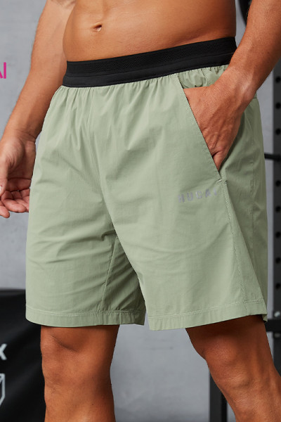
- Olive/Army Green: Seasonally appropriate for Fall/Winter; strong in UK and EU markets
- Steel Grey: Lighter than charcoal; provides mid-tone option for layering pieces
Seasonal Accents (20-30%)
Accent colors differentiate your collection and create visual interest. For Fall/Winter 2026, consider:
- Burgundy/Wine: Sophisticated, seasonally anchored, performs well in US and UK
- Forest Green: Outdoor-adjacent aesthetic; strong in European markets
- Rust/Terracotta: Trend-forward without being polarizing; works for statement pieces
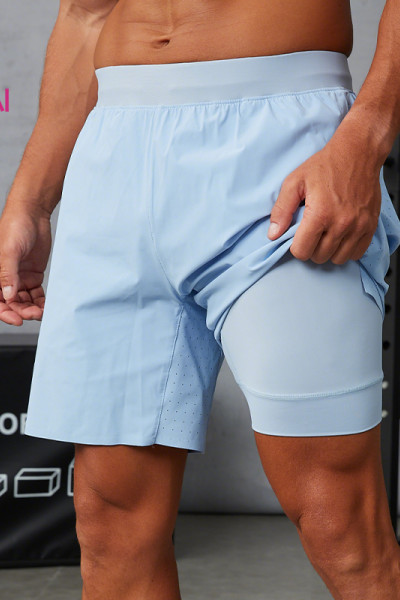
- Slate Blue/Dusty Blue: Cool-weather alternative to brighter blues; versatile for training wear
Statement Colors (10-15%)
Statement colors are your collection's punctuation marks. Use them sparingly for limited drops, capsule pieces, or marketing hero products. Options include burnt orange, deep plum, mustard yellow, or collaboration-specific colors.
3. Regional Color Preferences: US, UK, EU and AU Markets
Color performance varies significantly by geography. Private label brands selling into multiple markets need to either develop regional variants or choose universally safe palettes.
United States
US buyers favor bold, saturated colors even in Fall/Winter. Black and navy dominate volume, but accent colors like burgundy, forest green, and burnt orange outperform muted tones. Athletic-inspired bright accents (electric blue, crimson red) still work for gym-specific pieces.
United Kingdom
UK markets prefer more subdued, heritage-influenced palettes. Olive, charcoal, and navy are staples. Burgundy and rust perform exceptionally well. Avoid overly bright or neon accents unless targeting a very young demographic.
European Union (Germany, France, Netherlands, Nordics)
EU buyers, particularly in Northern Europe, gravitate toward minimal, muted color stories. Slate blue, stone grey, and sage green are strong performers. Scandinavian markets especially favor desaturated, naturalistic tones.
Australia
Australian Fall/Winter (June-August) overlaps with Northern Hemisphere summer, which affects color expectations. Darker navies, charcoals, and blacks work, but Australian buyers often retain some brighter accents year-round due to climate and cultural preferences.
4. Fabric-Dye Interaction: How Material Affects Color Output
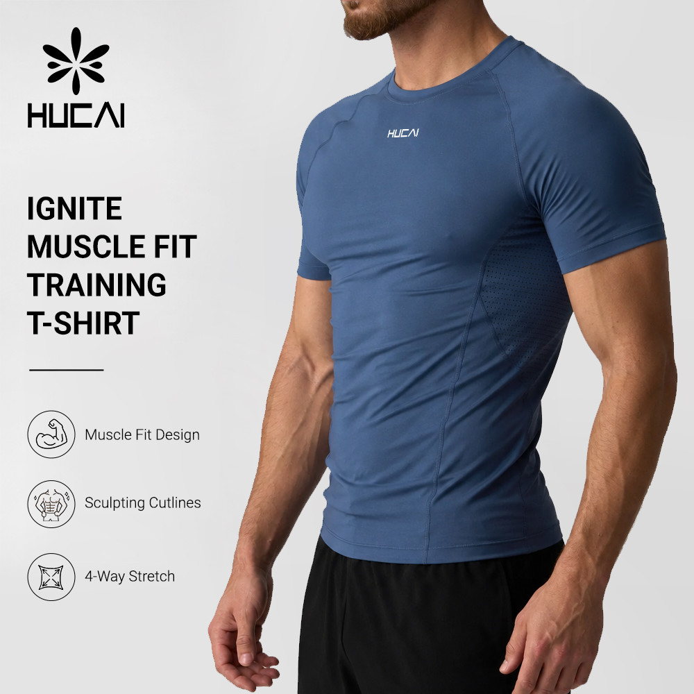
The same dye formula produces visibly different results on different fabrics. This is a critical but often overlooked factor in color planning. Private label brands need to understand how their chosen materials will interact with their target colors.
Polyester and Polyester Blends
Polyester takes dye differently than natural fibers. Disperse dyes produce vibrant, consistent results, but color depth can vary based on fabric construction. High-twist polyester knits hold color differently than brushed-back fleece. Always request lab dips on your actual production fabric, not just a generic swatch.
Cotton and Cotton-Rich Blends
Cotton absorbs reactive dyes deeply, producing rich, matte colors. However, cotton colors can shift after washing, particularly darker shades like navy and black. Pre-shrunk and enzyme-washed fabrics will show different color profiles than raw cotton.
Nylon and Performance Fabrics
Nylon requires acid dyes and can be finicky with darker colors. If you're planning windbreakers, track pants, or lightweight jackets in deep tones, budget extra time for dye lot approvals. Nylon also shows water spots and oil marks more visibly in certain colors.
Recycled and Sustainable Materials
Recycled polyester and organic cotton often have inherent color variations due to raw material inconsistencies. If you're marketing sustainable lines, embrace slight heathering or tonal variation as a design feature rather than fighting for absolute color uniformity.
5. Timing and Production Cycles for Color Planning
Color decisions have the longest lead time of any design element because they require physical sampling and approval. Missing color deadlines cascades into production delays that cannot be recovered.
Recommended Timeline
- Week -16: Finalize color palette based on trend research and sales data
- Week -14: Submit color standards (Pantone or physical swatches) to manufacturer
- Week -12: Receive first lab dips; review under multiple light sources
- Week -10: Approve final lab dips; confirm dye lot tolerances
- Week -8: Pre-production sample run in approved colors
- Week -6: Bulk fabric dyeing begins
- Week -2: Final color quality check before cutting
At HUCAI activewear, we recommend private label brands lock their Fall/Winter color palette by early May for September delivery. This 16-week window accommodates two rounds of lab dip revisions, which is typically what's needed to achieve color accuracy across multiple fabric types.
6. Building a Cohesive Collection Color Story
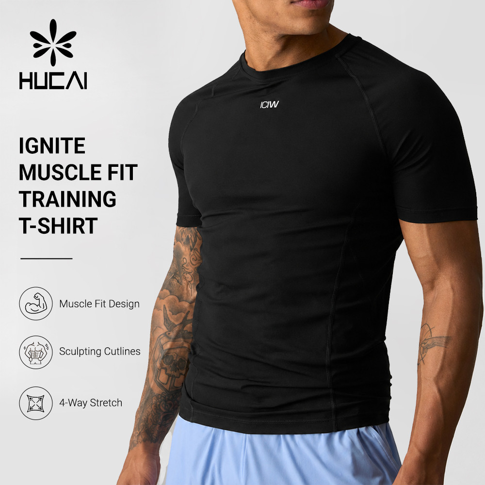
A collection isn't just a set of individual pieces—it's a system where colors need to work together. Cohesion means a customer can buy three items from your drop and wear them together without thinking.
The Mix-and-Match Test
Before finalizing your palette, run every top color against every bottom color. If more than 20% of combinations look wrong, your palette is too fragmented. The goal is for any neutral top to work with any neutral bottom, and for accent pieces to complement at least two neutral bases.
Color Family Consistency
If you're offering both warm and cool accents, separate them into distinct sub-collections or clearly defined drops. Mixing burgundy (warm) with slate blue (cool) in the same core outfit creates visual dissonance unless there's a deliberate design bridge.
Graphic and Print Integration
If your collection includes printed or logo-heavy pieces, ensure your print palette is derived from your solid color palette. A burgundy hoodie with a clashing bright red chest print looks amateur. Extract print colors directly from your approved solid colors.
Decision Check: Is Your Color Story Ready?
- Does your palette follow a 60-30-10 or 70-20-10 structure?
- Have you tested color combinations for mix-and-match compatibility?
- Are your accent colors appropriate for your primary target market?
- Have you requested lab dips on actual production fabrics?
- Does your timeline allow 14-16 weeks from color finalization to delivery?
- Have you accounted for fabric-specific dye behavior?
If you answered "no" to any of these, your color story needs more development before moving to sampling.
Planning Your Fall/Winter Collection?
HUCAI activewear helps private label brands develop seasonally optimized color stories with full lab dip support and 16-week production timelines. From palette strategy to bulk delivery, we manage the entire color development process.
Manufacturer Insight: What We See Working
Based on production data from Fall/Winter 2024 and 2025, private label brands that structured their palettes around 4 core neutrals + 2 seasonal accents + 1 statement color consistently outperformed brands with more fragmented approaches. The 4-2-1 model simplifies production, reduces dye lot risk, and creates cleaner merchandising.
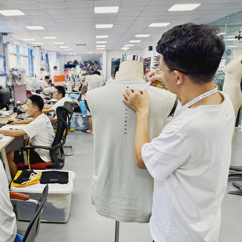
We've also noticed that brands who involve their manufacturer in color planning during Week -16 (rather than Week -10) achieve first-pass lab dip approval rates above 80%. Early collaboration gives us time to flag fabric-dye conflicts and suggest palette adjustments before you're emotionally invested in a color that won't work.
Frequently Asked Questions
For a focused 6-10 piece collection, 5-7 colors is the sweet spot. This gives you enough range for visual interest without creating inventory fragmentation. For larger 15-20 piece collections, 8-10 colors works if structured around the 60-30-10 model.
Both. Pantone codes provide a universal reference point, but fabric dyes never match Pantone exactly. Always follow Pantone references with physical lab dips on your actual production fabric. The combination of digital reference + physical approval is the industry standard for a reason.
Accept that perfect cross-fabric color matching is impossible. Set a Delta E tolerance (typically 1.5-2.0) and evaluate colors in context rather than in isolation. A slight variation between your polyester track top and cotton tee is acceptable if both pieces look correct when worn separately.
You can share your neutral core (black, navy, charcoal) across all markets. However, accent colors should be market-specific. Burgundy and rust perform better in the US and UK; slate blue and sage green resonate more in Northern Europe. Consider developing 2-3 regional accent variants while keeping your core palette consistent.
At HUCAI activewear, our MOQ is 100 pieces per style per color. For completely custom dye development (non-stock colors), we typically require 300-500 meters of fabric commitment to justify dye house setup costs. If you're testing a new brand, consider starting with stock colors and graduating to custom dyes once you have sales data.
Start color research and trend analysis 6 months before launch (March for September delivery). Finalize your palette 4 months out (May for September delivery). This gives your manufacturer adequate time for lab dips, revisions, and bulk dyeing without rushing quality.
Avoid highly trend-dependent colors that might date quickly (neon brights, extremely saturated oranges, pastel tones in winter). Also avoid colors that are difficult to dye consistently across fabrics (bright reds on polyester, deep blacks on nylon). Stick to proven neutrals and 1-2 safe accents for your first drop.
Order pre-production samples in all intended colors and photograph them under natural light, gym lighting, and retail lighting. Share these images with target customers or retail partners for feedback. If possible, produce a small capsule (2-3 styles) in your full color range for a soft launch before scaling to the full collection.
Final Takeaway
A well-planned Fall/Winter color story is a competitive advantage. It reduces production risk, improves inventory sell-through, and strengthens brand identity. The private label brands that succeed treat color planning as a strategic discipline—not an afterthought.
Follow the 60-30-10 structure. Respect regional preferences. Account for fabric-dye interactions. And start your color timeline 16 weeks before delivery. These fundamentals will serve you whether you're launching your first collection or refining an established seasonal program.
At HUCAI activewear, we support private label brands through every stage of color development—from palette strategy and trend analysis to lab dip management and bulk production. If you're planning a Fall/Winter drop, let's talk about how to build a color story that performs.
HUCAI activewear has manufactured men's activewear since 1998. We specialize in OEM/ODM production for private label brands across the US, UK, EU, and Australia. All product guidance is based on actual manufacturing experience and market observation. We do not make unverifiable claims about certifications or specific client results.